Have you already nailed the way to acquire more clients for your SaaS business, but retaining them remains a challenge? You may have already guessed that an effective onboarding process is exactly what can solve this issue for you now. So how can you double up revenue while keeping your acquisition effort and budget at the same level?
We’ve got you covered with this article! Here we are going to guide you on building your effective onboarding process and back it up with real-life examples of other businesses like yours that made their onboarding work like a dream.
Let’s dive into five strategic tips on designing onboarding for your SaaS that will finally get your users hooked on your tool.
1. Add personalization
Some would say that email marketing is dead as almost everyone is using email marketing as their marketing strategy. Is your inbox still handling this? Probably not.
While a lot of emails get unnoticed and even more may land in spam, some marketers have some techniques up their sleeve that are still working. So what makes those two types different?
The first group of marketers would send generic newsletters to big lists of customers at once with no personalization. The second group would choose a more targeted approach and trigger emails when users take certain actions. This group would send content that is relevant to customers and often contains some sort of personalization.
To create effective onboarding, you have to learn more about your users and that’s why you need to collect more information about them before ever sending the first email.
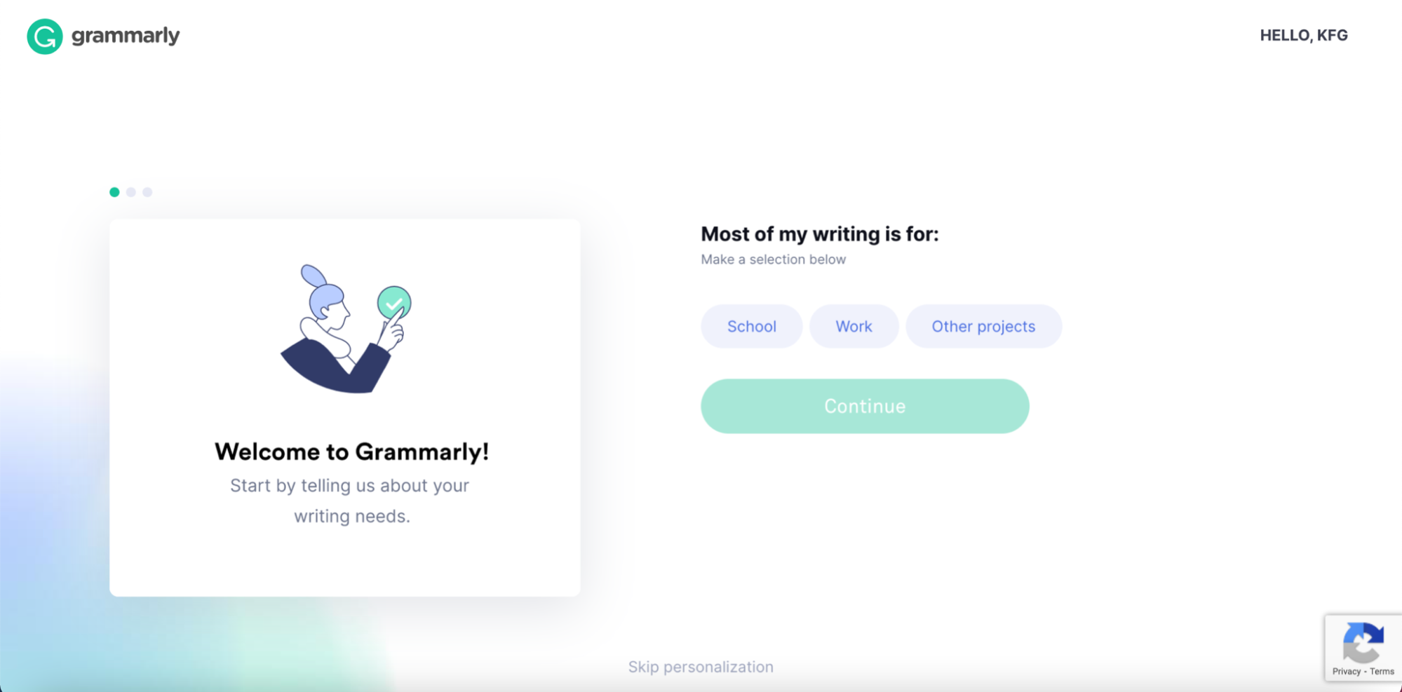
Instead of adding friction to your onboarding and sending surveys after users register for a free trial, do it the Grammarly way or you can craft your own unique and personalized survey content with tool like Essay Tigers.
To reduce friction, you can ask questions during user registration and use this information to personalize both in-app and email onboarding experience.
For example, when registering for Grammarly, a tool that scans text for mistakes, users are asked about the purpose of writing.
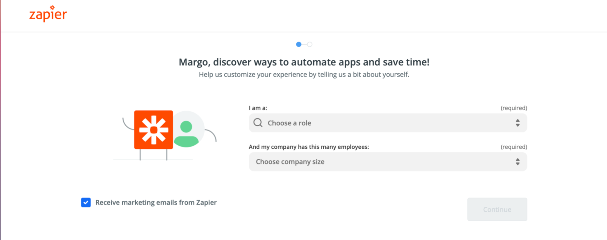
Also, you can identify organization size and user user roles to cater content better. That’s the way Zapier is approaching their onboarding.
Instead of asking dozens of questions about users, they are focussing only on the most relevant ones that will help provide a better onboarding experience.
In the first step, a user is asked about their role and the number of employees in their company.
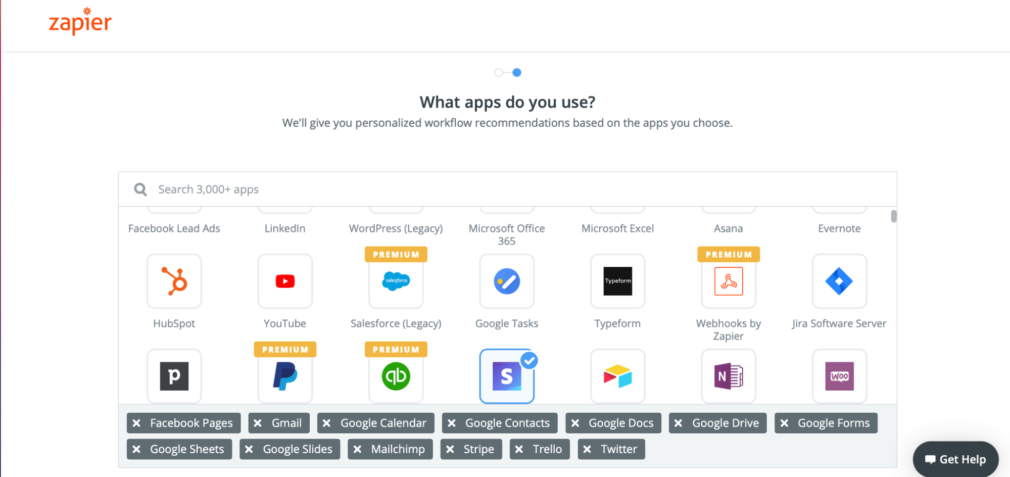
In the next step, a user is prompted to create the first workflow and experience a tool right away.
Remember that with every additional question you are asking your users at registration, friction increases. That is why you have to cut down welcome questions to their minimum.
2. Set up onboarding wizard
There are two types of users in terms of their learning curve. The first one is made of fast learners who can explore the system on their own and need little assistance. The second group are those who need considerably more guidance on using the platform.
When designing your onboarding experience, keep in mind that both user groups will end up trying out your tool and you will have to take account of both.
That's which Sprout Social covered with their onboarding.
After a user registers, they are taken to a welcome screen with a progress bar and four main modules that are crucial parts of the platform.
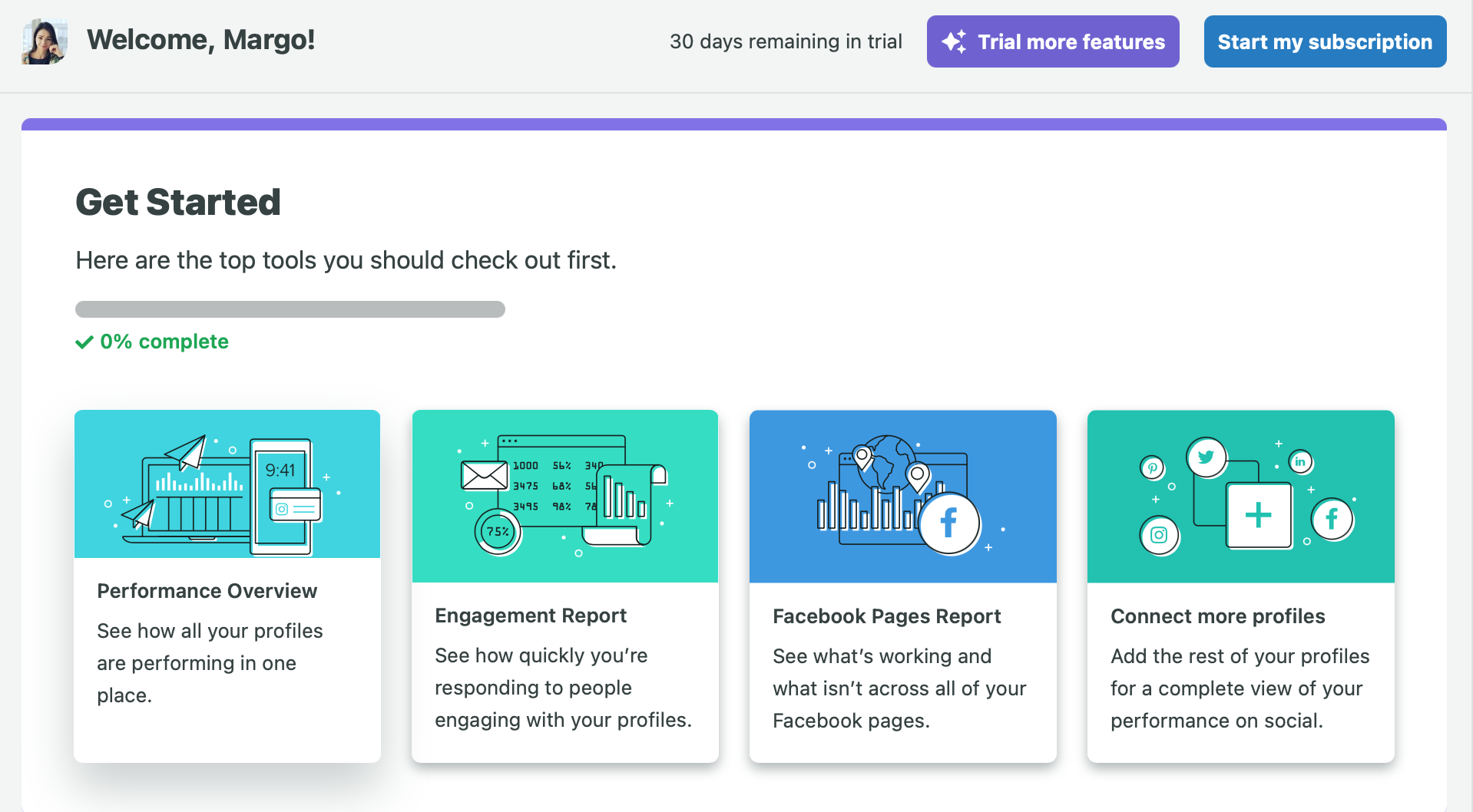
After clicking each of them a user is taken to a corresponding module and gets familiar with the functions.
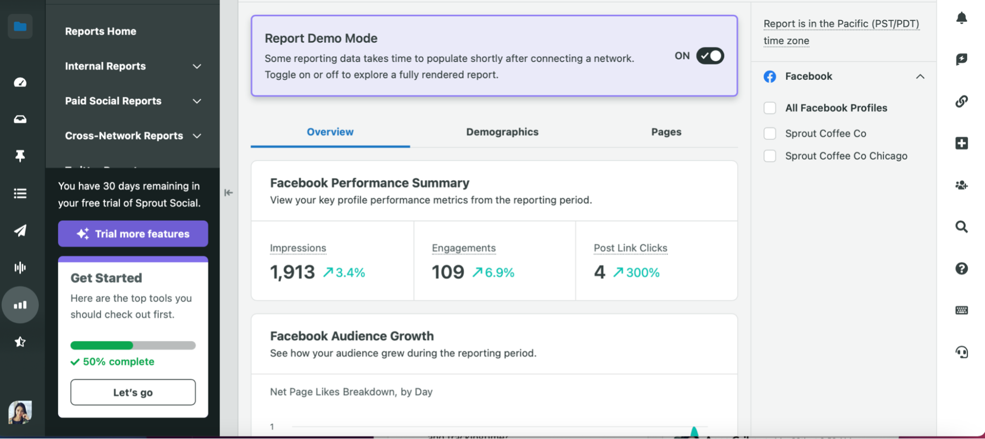
In the meantime, the progress bar is updated and the modules that have been visited are displayed as completed.
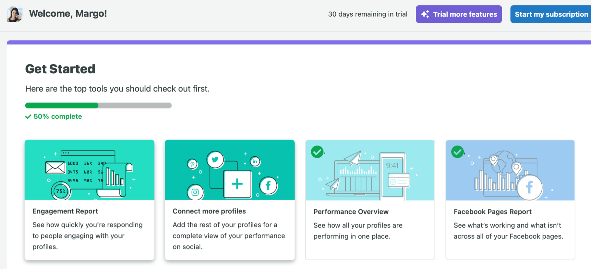
This onboarding is simple and fast – users with different learning curves will find it useful, simple, and fast to go through.
3. Send action-based and drip email campaigns
Getting a user to test out your tool is easy – just launch a paid ads campaign and see users registering and testing out your tool. But how many of them will come back over the following days?
That’s where triggered email campaigns can help create another necessary touch point with your users and bring them back to your platform.
So what is the best way to get users to explore your tool and understand its value?
There are two ways you can approach email onboarding campaigns – with drip and action-driven emails.
Before setting up your campaigns, start with understanding the milestones your users have to achieve to fall in love with your product.
Let’s say you are working to improve the onboarding experience of a social media management tool. As a first step, your users have to connect their social media accounts to schedule the first post. However, connecting their accounts is not the action that results in account upgrades – it is only necessary to get the ball rolling. Scheduling at least three posts on a weekly basis is that set of actions that usually results in a user upgrading their account.
Knowing this, you can design your email flow to help users connect their social media accounts and achieve the first important milestone. Next, you can send them regular tips on improving their social media performance and urge them to post more on Twitter and Facebook using your tool.
To send separate campaigns, you might want to create filters for your contact lists to send separate campaigns triggered by user actions.
Apart from action-driven campaigns, you can also use drip campaigns and send a set of emails that deliver necessary information on all crucial functions.
For example, Asana uses drip campaigns to make their users familiar with the core features and lead them to their “Aha!” moment.
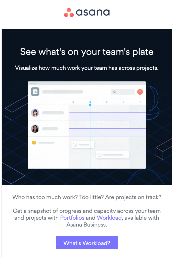
But what if some users don’t read your emails? Then they would probably miss out on a lot and will never understand some really cool features and benefits your tool offers.
That’s where you mustn’t underestimate the power of follow-ups. Good follow up reminders can do miracles when it comes to delivering useful product tips. In this case, you can set up rules to send additional emails to the users who haven’t opened a previous email. This way there is a higher chance of them discovering the features they would otherwise never learn about.
4. Refer to your knowledge base
There is one point most great SaaS businesses overlook – customer support. Just go to Trustpilot or G2 and check out the reviews of your top-of-mind subscription business.
It won’t take long to discover that bad customer support is mentioned as one of the tools’ negative points by the users giving two- or three-star reviews. In most cases, they complain about customer support agents getting in touch too late or not being able to resolve the issue at all.
That’s not exactly what you want to read about your business online, right? So what if your support agents can’t resolve every ticket within the first day?
Building a knowledge base that users can easily navigate and find answers to is a good starting point.
When onboarding your users, you can refer to the articles in your knowledge base – in onboarding emails or directly in your dashboard with helplinks.
Knowledge bases are quite a boring thing, aren’t they? However, there are few smart ways that you can make them more engaging and help users understand a solution considerably faster.
For example, you can include GIFs that visualize quick actions a user must take or some screenshots, or you can even use a GIF compressor that optimizes GIFs to ensure quick loading times and smoother user experiences.
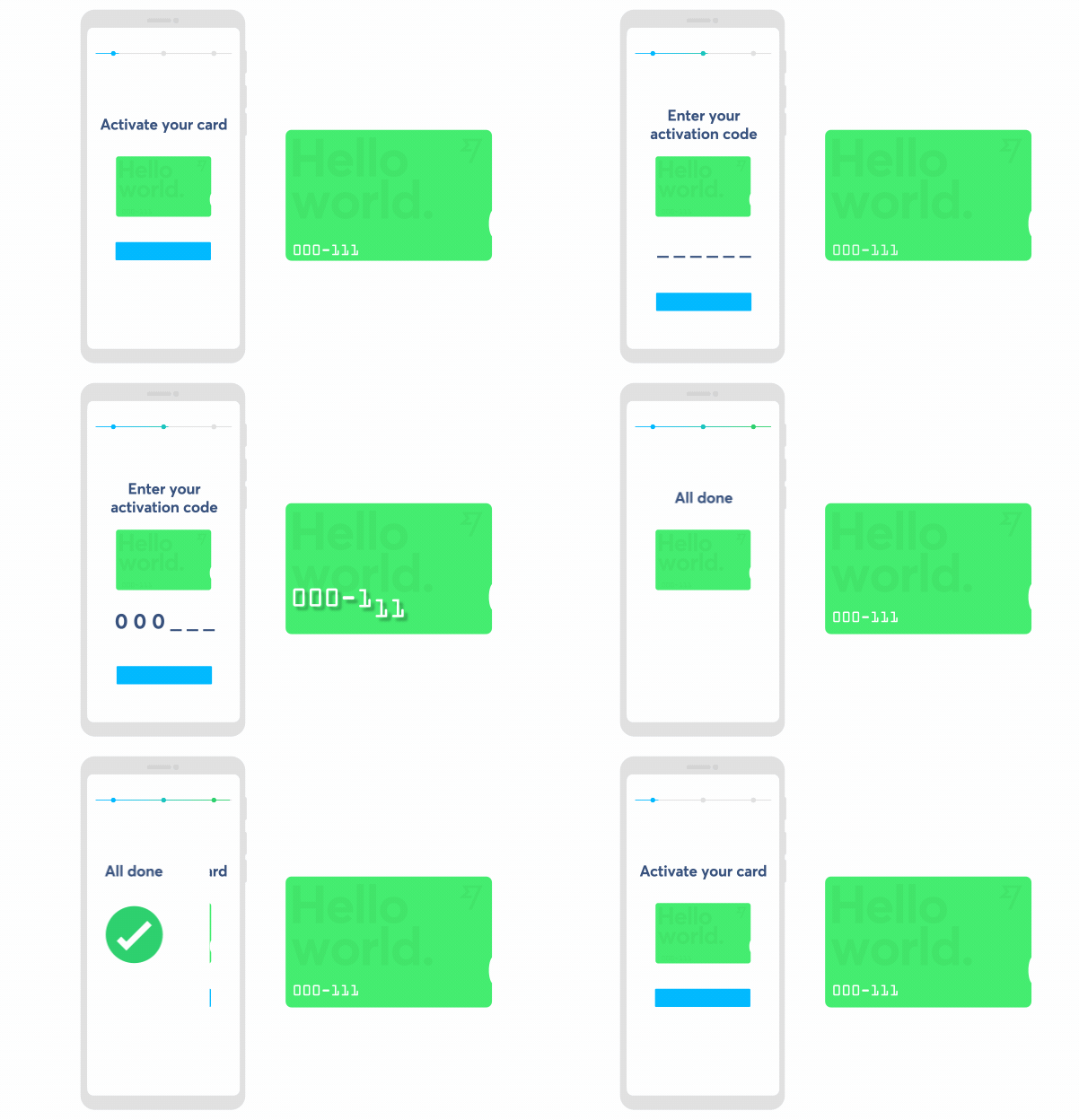
Wise, a tool facilitating money transfers worldwide, is helping their users to navigate the knowledge base by assigning articles to topics.
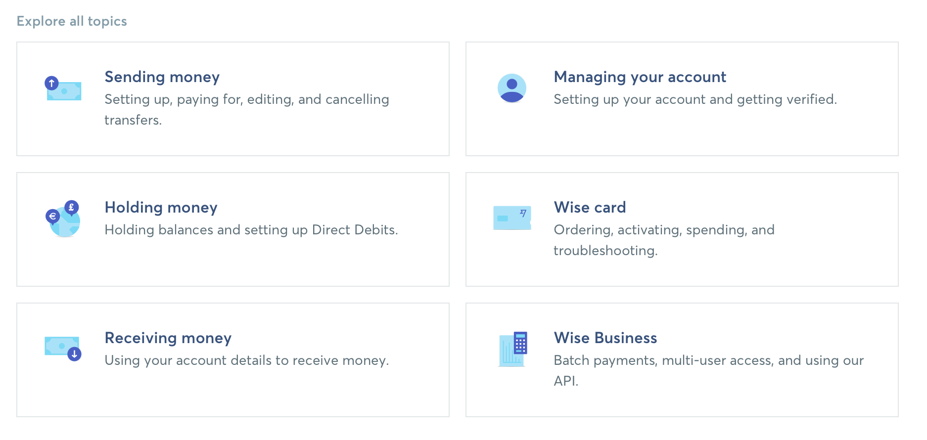
In some articles, they are using animated GIFs that visualize the process and make everything clear at a glimpse.
5. Measure effectiveness
Once you have set up your onboarding sequences, both email and in-app and built your knowledge base, don’t stop there. Have you wondered if you are using your time effectively to generate the maximum impact on your company’s bottom-line? The next step is measuring its effectiveness after the launch and checking if it has reached the key objectives. If not, you should be looking for a reason that blocks its performance and iterate on it again.
Before we explore the steps you can take to improve the performance, let’s start with measuring its effectiveness.
First things first – check how onboarding contributes to getting users to use your platform’s core features. There are no universal criteria on how to assess such progress and you would probably come up with your own methodology. Let’s see how you can design one as an example.
If you offer a document signing software, you want to check the percentage of users who have signed more than three documents online and have sent it to their clients. You may take into account that once users sign more than three documents they usually upgrade their account.
While we can be optimistic and hope for the best, even the best onboarding can fail when confronted with real users who have their own way of thinking and doing things. So what can you do to improve your onboarding performance? There are a few ways you can inspect and resolve the issue.
1. Ask your users in surveys
Create a survey asking users to assess their experience with your tool and mention any particular challenges they are having. By asking, you can identify where your onboarding underachieves and work on an improved sequence.
With this feedback, you can redesign steps or add new ones to help lead users to their “Aha!” moment faster.
2. Check user behaviour in real-time
Use heat maps to help see how users are interacting with your onboarding flow. When watching recordings, you may want to ask yourself a few questions.
Is there a trend where users skip some steps that don’t interest them? Maybe, you could switch them off as they don’t contribute to a better onboarding experience.
Are your users still searching for something once they have gone through the whole in-app onboarding process? You could add another step to account for the users’ onboarding needs better.
3. Analyze tickets
Check your helpdesk to see if users are asking the same questions over and over again. Then think of how your onboarding sequences can better explain them from the very beginning.
One of the benefits is making it easier for users to explore your tool and learn about its value faster. The other one is making the life of your customer support agents much easier as users won’t reach them out with the same questions again.
Final notes
Retaining users is often a more difficult task than acquiring them. Instead of pouring more marketing budget into acquiring new users that don’t convert into clients, rethink your onboarding flow.
By creating a better in-app experience, you can guide users to their “Aha!” moment faster and, as a result, help them see the value in your tool. Sending action-based and drip campaigns can help create an additional touchpoint and lead them to the next crucial actions on your platform.
Having implemented your onboarding flow, never stop measuring and testing new things based on your user feedback – there is always a space to improve it and boost your trial to paid conversion rate.
About the author:
Margo Ovsiienko is a Growth Marketing Strategist and a blogger at Margo Leads. She creates content that converts website visitors into paying customers for SaaS companies and tech agencies with sales funnels.
What would you like to know and what would be the best way to share this information to you? What is the best tips & tricks, what workaround do you use? We'd really appreciate your insight on these ones to make our integrations better, more productive and much more efficient. Comments, tweets are always welcome.